Monday, September 26, 2011

Pinhole Photography

This was done in Sec 2. I just found it in my art file.

The concept was to take different things in Nanyang, different things that are significant to me in Nanyang.


That photo was my favourite, but it got smudged and stuff. (I don't know how it happened. Maybe over the years it got oxidized or something.) It was a picture taken at the red path, behind the school, on a 'patio'. I seriously walked to many parts of Nanyang during that period of time. I wanted to take the boarding school, but it did not come out.

I think I probably overexposed it. My can was really small and the EV at that spot was quite high that day. I took the same spot 3 times and this was the best shot I could get. I swear it wasn't blur in 2009. Maybe I should have opened the pinhole can for just 1 second instead.

So out of the rest, which are still clear and nice, my favourite was this one:


This picture was taken when my pinhole can was placed on the picnic table (behind the canteen, near the basketball court). In the foreground it's the wood of the wooden picnic table. And in the background, there's part of a school and part of the swing.

I like how the picnic table part swirls and creates a different effect. But then I feel that this photo is quite random (the composition).

From the photography lessons, I have learnt to be more responsible and more considerate from developing photos and loading paper in the dark room. Also, I have learnt to be more patient and more careful when waiting for the EV device and calculating the seconds for my can.

Heart


This was the final of my EOY painting last year. It's a heart with many, many veins all around in the background.

I wanted to make a heart because, I feel that the heart is a really, really, really vital organ. I mean, it's between the brain or the heart right? Like, which is more important.

Some say it's the brain because it's unique and nobody else can have the same brain as you. But, then I thought, so what if you have a working brain but your heart isn't working? I mean, without the heart pumping, it's not like having a brain is gonna be of any use. But, so long as the heart is still beating, anything can happen. That's why, in a way, the heart is also a physical barrier for man.

If someone is in a coma and pronounced brain dead, it doesn't mean the heart ceases to work. It can still work with the help of support. Then again, the brain can't be start up by anything huh? So which exactly is more important? I'll leave this question for now and continue talking about my artwork.

What I've done is almost like what I had in mind. I wanted something really complicated. But I didn't want to kill myself, so I settled for semi-complicated. I had shaded the same thing several times, scanned it in the computer and played with the colour on Photoshop. (below)


I intended to paint it in red, so I changed the hues to a monochrome of red to see what it might look like. I think it's actually quite different from how red it actually turned out to be. But I like them both equally.

I also drew the heart and the veins separately initially:


And finally, I combined them together and that was what it looked like.

I also tried to play with the composition:


But, I think it wasn't very useful in the end. I feel that it looks best when the heart is central, it shows the importance of a heart.

For the medium, I used poster paint. In actual reality, I wish I could have used oil paint.. It would have been much easier to do all the blending. But I'm still quite pleased because, before coming to Nanyang, I have never actually painted anything for whatever reason. So I was quite an amateur at painting, regardless of the type of paint I use.

I didn't even score an A I think. But I think I tried my best in blending and I'm satisfied with the outcome. I could have chose to do something easier, where I only need flat plains of colours, like a cartoon or something. But I challenged myself, choosing something difficult rather than settling for something easy.

Sunday, September 25, 2011

Graphic Novel Character Creation


These 2 characters were drawn during sabbaticals. I did cosmology and graphic novel. So on the last 2 days, we were given time to design a cover page for our own graphic novel. The cover page had to have our characters. I was grouped with Yinnshan, Xuedi.. And someone else, I think it was Esther Wong.

So anyway, our story was about this lonely Joker who created an angel and a witch out of accident. He had only intended to create one companion, but 2 were created instead. However, contrary to popular belief, the angel in our story was evil, and the witch in our story was good. I drew the angel and the witch, as shown above.

The angel was meant to look innocent. But in reality, she's not that innocent. Whereas, the witch was meant to look depressing. Her face isnt shown either because she's supposed to be really afraid of people finding out what she looks like. Actually, the angel and the witch are supposed to be twins, so there's no need for the viewers to know what the witch looks like.

The wings for the angel.. I feel are a bit weird. They're flat. But that was before I drew wings for my elderly room. I'm pretty confident of drawing voluminous wings now. As for the witch, I think her cape isnt dramatic enough. I should have drawn it longer. And her hair is a bit weird too, the outline is too spiky.

But overall, I'm quite pleased with it? Because, I don't normally draw the human shape, I kind of avoid drawing humans as far as possible. I don't really like how I have to make everything proportionate.


On the final day, Xuedi didn't come.. and she drew the Joker. So I had to rush out the full cover page (above), and drew the Joker according to my own memory. I think.. the cover page is kind of.. strange-looking. It's really amateur. I wonder how those mangakas (manga authors) do it. Or do they hire people? No, I think they do it themselves.

Overall, I think this little activity sparked a new interest in drawing manga for me. Normally I probably only read manga. But now, I think I might create a manga in my own free time, and maybe even take up manga-drawing lessons.

Van Gogh's Starry Night Over The Rhone

Photobucket


So I painted this for my oil painting last year. When the different categories were announced, I immediately gravitated towards Impressionism. I mean, I really wanted to do something like VAN GOGH. I would have chosen "Starry Night" (1889), but Xuedi chose it. Thus, I chose "Starry Night Over the Rhone", which, in my opinion, is really beautiful even though it may not be as famous as "Starry Night" (1889).

We were required to incorporate something about Nanyang inside. But I didn't in my practice.. This was what my practice piece looked like:

Photobucket


Pardon the poor quality.. I took it with my phone. eeps. It's a picture of the incomplete version also..

Right, so anyway. I painted this with the help of my mom's close friend, I call her Auntie Ruth. She's a graduate from NAFA I think, according to my mom. I think she's really, really into art. She's quite old already, but she still does her own art in her own time.

She pointed out to me that the reflected lights in the river are painted horizontally in small strokes, and she told me to note the direction of the brushwork. I would have never realized that I had to do it that way if it werent for her.

This is what my final looks like:


(Again, I took the picture with my phone.. so, may be kinda blur)

In the end, I think I got an A1 for my oil painting. I really hope to get it back soon. It's the first oil painting I've ever done, I myself think I've done it really well and it means a lot to me.

AEP Coursework: 3D Model


So this is what my final 3D model of the adulthood room looks like. I think it's relatively well done, considering the fact that I'm a total sketchup beginner. I think it's more suitable for landed property though? Because of the windows. I got the idea for the windows from Secret Garden.. I'm sure I've posted my prepwork for the adulthood room on my blog, so I'm not gonna talk about it again.

Anyway! This entry is about the materials I chose, and the difficulties I had with creating this room. The 3 main colours were black, white and blue. I think it's Persian blue? Or something, I cant remember. These were represented by black/white/blue laminates. I didn't want to use wood or metal.. But I wasn't sure what kind of material could create something blue and not be painted.. (I hope I'm making sense)

So.. the flooring is olympic white marble. I tried black marble, but it looked too dark. I know the adulthood room was not meant to embody freedom, but making it so dark would be too over the top.

The glass I chose for the windows were grey-tinted, not blue-tinted. Think it better suits the colour scheme. The frame of the windows are black metal. Anything I try to paint black in sketchup just looks pitch black, I didn't know how to differentiate linoleum from metal, hence they look the same.. It's metal because.. the house in Secret Garden used metal too, I think.

And.. the recliner is black leather. I managed to find some good leather-looking texture which is black and doesn't look like the linoleum or the metal in my model. The mirror.. I couldn't exactly find a texture for it. Reflections aren't fixed, so.. there aren't any ready-made mirror textures available on the net, I mean.. each room is different and each reflection in the mirror is different at different angles. Thus, I just took something that looks somewhat reflective, but isn't really reflective.

Lastly, I added final details, which I downloaded from the Google warehouse, like the books, the folded clothes and the photo frame. I didn't see the need to create them because they weren't the main part of my artwork. I just wanted to decorate the room, so it has the 'lived-in' feeling.

And there you have it. My 3D model~

Block Test 2 (Ng Eng Teng & Han Sai Por)

"Looking Ahead" (1987)


"Growth" (1985)


2a) Describe the subject matter of both works.
The subject matter of Ng Eng Teng's "Looking Ahead" (1987) is the human figure. The torso as well as the forearms are omitted, leaving only the head, the forearms and supposedly the thighs behind. The subject matter has been simplified, as can be seen on the face of the sculpture. By omitting the torso and forearms, viewers place more emphasis and attention on the face and the forearms, but viewers also are more aware of what is missing. In this aspect, Ng seems to have created something out of nothing. The facial expression shows that one is looking far ahead, as the eyes are squinting. There is also a trail protruding out from being the head, supposedly to suggest hair. This hair is sculpted in such a way that it looks like it is blowing in the wind. Also, the position of the arms seem to imply that the figure is trying to hold back the hair, refraining it from blocking its "vision". It gives the viewer the idea that maybe this figure is standing in a wide, windy field, looking far ahead, with the wind blowing in the hair.

The subject matter of Han Sai Por's "Growth" (1985) is abstract. There are no defined details that hint the viewers on its subject matter. It could be droplets of water frozen in time or dollops of cream. But, there is a little clue from the title of the artwork itself. The word 'Growth' suggests that something is growing. The subject matter is simplified and organic. It evokes a sense of organic vitality through how these 5 separate shapes seem to relate to each other and form one complete, whole artwork. This sculpture is absolutely white and polished smooth, and twisted into abstract shapes. The shapes each have a more pointed end on one side, and this seemingly directs the viewers' eyes around the sculpture. Its simplicity, being pure white, gives viewers a sense of tranquility and highlights essentialist beauty.

2b) Discuss similarities and differences that exist in their treatment of forms and use of materials.
Ng Eng Teng's "Looking Ahead" (1987) shows Ng's unique treatment of forms. Unlike Han Sai Por, he takes a full complete human form, dislocates it and omits the parts he does not want. He has simplified it down to what he deems as essential. For example, to him, the eyes and the mouth are the key elements of the face and are necessary in order to express emotions. He does not think much of ears, as he feels that they do not play a significant part in exuding emotions. Hence, the ears are seemingly not present and cannot be seen in this sculpture, only the eyes, the mouth and the nose. Also, after selecting the body parts he wants, he has to rearrange it into the way he wants, which is the way that best conveys the intended emotions. This sculpture, as entitled "Looking Ahead", is to portray a human figure who is looking ahead. Thus, he has given the truncated human body parts a posture which suggests the action of looking ahead.

Ng Eng Teng's "Looking Ahead" uses bronze. Bronze is a malleable and durable metal, making it very lasting. Ng thinks that art should be timeless and able to withstand the test of time. Hence, bronze, being a durable metal, is the ideal material for him to make a timeless, long lasting work of art. The texture and finish of a sculpture is also very important to Ng. In this case, it is rough, unlike Han's "Growth" which is smooth.

Han Sai Por's "Growth" is somewhat similar to Ng's "Looking Ahead" in treatment of forms. They both choose to do their sculptures in an abstract manner. However, Ng is more focused on distorting and omitting to highlight the essentials while Han is more focused on makin the sculpture organic and simple without omission. Han's "Growth" is very simplified, fluid and there are hardly any details that could suggest its subject matter. This is unlike Ng, as his sculpture still has dents and protrusions suggeting eyes, noses and hair. The arrangement of forms in Ng's sculpture is to create a human-like figure while the arrangement of forms in Han's sculpture is seemingly to form a somewhat circular, rounded shape.

As for the materials, Han uses marble instead of bronze, like Ng does. Ng picks material and explores it, and uses it for the qualities he uncovers in it after exploration. However, Han discovers the character of the material through physical context. Through the chiselling and drilling, she will understand the qualities, but she does not try to change it into what it is not. If marble is hard, then it is hard. For "Growth", she uses marble and even polished it. This shows that she understands the hardness and brittleness of marble, and her treatment of material changes with every different type of material she uses. Out of a delicate material like marble, she carved a delicate and sophisticated sculpture of "Growth". This seems to convey what she feels about man's growth being a part of nature.

2c) In your opinion, which work would you choose to be displayed in Nanyang Girls' High School as part of our permanent art collect and where will the chosen work be exhibited? Discuss with consideration given to the artist's background, repertoire of works, approaches to art, etc.

In my opinion, I would choose Han Sai Por's "Growth" to be placed in the grass patch near the main gate in Nanyang Girls' High School. I think, given Han Sai Por's strong believe that human and nature are one, her works often, subconsciously or not, exude her thoughts on that philosophy. This can be seen in her other works such as "Spirit of Nature" (1988), whose tranquil monumentality exudes essentialist beauty. The shapes of the three 'blobs' are also very simplified, organic and abstract. This seems to remind one of nature. Leaves are rather simple in their own irregular, organic shape. Hence, with regard to Han's strong interest in nature, "Growth" should be placed outdoors, in a natural setting like grass.

Apart from Han's philosophy in relation to nature, I personally feel that the organic fluidity and white colour of "Growth" will blend in well on a grass patch. It will not look out of place and will probably even enhance the beauty of the outdoor school environment. The size of "Growth" is also not exceptionally large, and on top of being white, it would not be too attention grabbing. Nature itself is not attention grabbing, it is everywhere and is very common, especially in Singapore. Thus, I think the size of "Growth" is very suitable to display outdoors in the midst of nature.

Other than the above explanation as to why I chose such a location, I think Han's sculpture embodies certain values that make it fit to be in a girl's school. Firstly, the colour white often symbolizes purity, and purity happens to be one of the four values of Nanyang Girls' High school. Next, I think the fluidity of the 'blobs' are very feminine, and really suitable for a girl's school. Lastly, I also think that since Nanyang Girls' High School already has a collection of Han Sai Por's works, adding something different of Han Sai Por will not only brighten up our school compound, but provide a larger variety. The other works that Nanyang has are made of metal, but not made of marble like "Growth". Hence, I choose Han's "Growth" to be part of our permanent art collection in Nanyang Girls' High.

some parts edited to improve my essay~

Block Test 1 (Lucia Hartini)

I actually don't remember where I've put my BT1 question paper.. So there are no questions, just answers. Some bits were edited so as to make my essays better than they actually were. (under the exam conditions and everything)

"Spying Eyes" (1989)


1a)
The colour that dominates this painting is orangey-brick red. This colour could possibly represent aggressiveness or the feeling of being restrained because Lucia Hartini feels very angry and suppressed about the gender discrimination (against women) in her society. This orangey-brick red is painted on the zig zag brick walls, and these brick walls seem to entrap a woman, who is in a vulnerable foetal position. This use of the orangey-red further reinforces the feeling of being trapped, restrained and suppressed as it surrounds the woman as though it is enclosing in on her.

The sky is the background is predominantly black with some wisps of red clouds or smog. This smog seems to be red, but as it seeps in between the brick walls, it becomes white. The black could show how bleak Lucia Hartini feels her life is, while the red-to-white clouds encroaching towards the woman could be how the society's discrimination against women is like to Lucia Hartini.

Another colour used is medium blue. The colour blue is supposed to represent power as it was worn by female warriors who protected the sultans. However, in "Spying Eyes", it is not the case. The woman's vulnerable and powerless posture makes her donning of a blue dress not powerful at all. I think Lucia Hartini's choice of blue could suggest sadness or it could also mean that maybe she would like to see herself become a strong female warrior in time to come.

The medium shade of blue greatly contrasts the bright orangey-red. It's like fire and water clashing. It draws the viewer's attention to the painting and helps in conveying Hartini's message in a subtle way.

As for the brushwork, they are very well-blended and being well-blended, it makes the forms in this painting look very realistic even though such a setting is not possible in real life. When an impossible setting is depicted in a very realistic manner, it allows the viewer to be more attracted to the painting. Personally, I think it even allows the viewer to imagine what it might be like to be in such a surrounding that is portrayed in "Spying Eyes". Giving the viewer a sense of what her message is in the painting.

Another thing is that, Lucia Hartini's brushwork brings out the fluidity or rigidity of objects, depending on what they are intended to be. The flowing, draping fabric and the hard brick walls brings out another stark contrast. Having painted the walls to be so rigid and the cloth to be so fluid, it embodies the situation Lucia Hartini is in: The harsh criticism and skeptical looks of the society against her vulnerable, soft self.

1b)
I think that the main social concern being expressed in Lucia Hartini's work is the issue of gender discrimination in her society. Lucia Hartini was born as a Catholic in a predominantly Muslim environment. The Muslim culture strongly believes that women only lived to cook and care for children, hence Lucia Hartini would most likely have felt very suppressed as an aspiring female artist at that time. This feeling of being suppressed, she would then transform it into her artworks, and this can be seen in "Spying Eyes". The woman in the foetal position dressed in flowing, blue drapery is a symbol representing the women who are suppressed in that society. The aggressively zigzagged, hard brick walls would translate into how Hartini feels confined in real life as a woman, while the eyes on the walls would symbolize the scrutinizing and doubtful eyes of the society.

Hartini is obsessed with eyes as they frighten her and she feels like they follow her everywhere she goes, watching her. This obsession with eyes can be seen in the "Spying Eyes" sequel, "Srikandi" (1993). There is a radical and vast difference between "Spying Eyes" and "Srikandi" though. In "Srikandi", the sky in the background is not as bleak as the one in "Spying Eyes", there is one straight wall and one zigzag wall. I thought the zigzag walls in "Spying Eyes" representing hurtful criticism from the society, so with one wall straight in "Srikandi", it felt like maybe Lucia Hartini did not get as much criticism anymore or maybe she just took it in her stride. Most of all, the woman in "Srikandi" is standing upright, looking very confident.

The transition from "Spying Eyes" to "Srikandi" seemingly tells people of Lucia Hartini's journey of self-discovery and self-development. She has changed from being a vulnerable and passive woman to a strong, confident woman because Srikandi is a brave and bold female warrior from the Javanese shadow puppet in the Mahabharata epic. On top of that, the woman in "Srikandi" bears a resemblance to Hartini herself in real life, thus showing that Hartini has now become a modern woman who is striving for or has already achieved some equal status in society. Also in "Srikandi", the woman stridently stares back at multiple disembodied eyes, which represent the scrutinizing and discriminating eye of the society. This is way different from the vulnerable woman in "Spying Eyes" who is already "defeated" and cowering from a beam of scrutiny from just one eye. This further re-emphasizes the fact that Lucia Hartini has grown from a passive woman, who was born to be submissive to man, to a self-confident and powerful woman, wearing the blue cloth like a brave female warrior.

1c)
Lucia Hartini, living in a society that discriminates against women, could not express her anger and frustration in a straightforward manner. To avoid more scrutiny, her works have become heavily symbol-laden. Exploring dreams and imaginations allowed her to express her personal feelings or convey personal messages subtly. For example, in "Imagination XII", she placed a wok in between two cliff-like edges and set it ablaze with explosions. This represents her anger and the wok represented how women in that society were expected to be housewives. If she had done this in a less dream-like manner, the society would easily link it back to her emotions and hence, create even more scrutiny.

I feel that Lucia Hartini's use of dreams as part of her works is very effective. Just like writers use metaphors to convey emotions, artists using symbols to convey their emotions can also be just as effective. Through Lucia Hartini's "Spying Eyes", I can read between the lines and know what it feels like to be the one lying like that on the ground. Through "Srikandi", I can feel that she no longer feels vulnerable as the woman is in a powerful stance. Through comparing "Spying Eyes" and "Srikandi", I can tell that she has changed and is no longer the submissive woman that the society intends her to be. The zigzag walls or straight walls allowed me to better understand what she feels like in that environment, whether it is painful and aggravating or whether it still feels harsh but her own personal change just bends the feeling of pain and aggravation into something that does not affect her as much anymore. I think this is all due to the fact that, her choice of symbols is very appropriate. The choice of symbols can play a big role in helping the viewers pinpoint the emotion or message that is being conveyed.

Just like "Spying Eyes" can tell me how much turmoil was in her (at that time), "Umbrella 2000" can literally show me that she feels like she carries the weight of the universe on her shoulders. In "Umbrella 2000", a woman, wearing a white dress, was shown carrying an umbrella. It looked really heavy because as the handle of the umbrella extends, it becomes the universe. The usual 'carrying an umbrella' become 'carrying the universe' through this symbolic portrayal done by Hartini.

Monday, September 19, 2011

Dabblings In Colour Scheme (Childhood Room)

I didn't manage to include this into my prepwork. So I'm gonna do it on my e-portfolio. It's hard to explain and describe it, because when I say 'green', people are gonna think 'what green? dark green? lime green? moss green? dirty green?'. So.. I hope my attempt at being specific and detailed works. Because I'm going to describe what sort of colour scheme I had in mind for each of my rooms with the help of some pictures.

Childhood Room
I wanted something fantasy-like. Because, as a child, I was always inspired by things like princesses, Barbie shows, magic, etc. I wanted something that could excite a child and make him/her believe in magic, something that could be really soothing. So this is what my childhood room sort-of looks like:


For the flooring, I intended to use faux grass carpets, like in an enchanted forest. And as for the walls, I wanted something like.. a mural of an enchanted forest. Like in these two images below:


As for the bed, I would have made the sheets baby blue or baby pink, depending on the child's gender, and as for the canopy, I wanted translucent curtains.


The initial colour I thought of was yellow, because yellow daylilies (the flower which I took inspiration from) looked best in yellow. But pastel blue/pink and bright yellow seemed strange. So, I think beige or white. Then I think the shape of the overturned daylily flower itself is going to be wired inside.. I'm not sure how they make these things.

The window seat would be wooden with cushion on top. I was thinking light, fair wood. Because it better suits the frequency of the rest of the room, which is pastel and soft. But there are so many kinds of wood.. I'm not sure which is light/fair and used for furniture.

The crocus wardrobe would be a gradient purple, like a crocus flower (from the inside to the tip of the petals):


Lastly, the dandelion-inspired lights. The main feature of a dandelion is that its seeds fly really beautifully. I hoped to incorporate such natural beauty into my design. I mean, normally people have dandelion murals on their walls like these:


But instead of paint on a wall, I'd change them to popup dandelion-shaped lights. There's an example of dandelion-shaped lights which I found online:


It looked so much better than I could have imagined myself. So, my dandelion lights are a fusion of both. The arrangement from the mural and the lights from the circuit example.

Overall, in my imagination, it looks really like an enchanted forest. However, I'm quite sure that young boys will not like this room, and may even find it too 'girly'? I'm not sure, what do young boys want nowadays? Things like racing cars, action figure heroes, football, right?

Elderly Room

I took really, really, really long trying to design the Elderly Room. And at the end of the day, it was probably only 70% complete. I dont have any scans this time round, I cut them up and pasted them on the black boards before I had the chance to scan them. Hence I'll just type out everything..

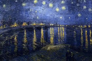
First, it was the bed. My theme for it was 'death and wings', because there's this belief that, when people die, they become grow wings and fly to Heaven, or angels come down to Earth to bring them to Heaven. Also, I believe that most people would want to pass away peacefully on their own beds. As reference, I used this pair of wings:


And, I created a somewhat-Victorian styled bed. I drew carvings on the bed, as tombstones in real life also have carvings. I also added legs. You may notice that modern beds do not have legs. Just Google 'modern beds', 'Victorian beds' and 'Baroque beds' and you'll see the difference. I think bed legs really change the feeling one gets from the furniture.

Next was the side table/night stand. My logic was that.. things were placed at the side table for convenience, things like medication, reading glasses, etc. So I tried to create a piece of furniture from olden medication, which was like syrup bottles. Look below:


But.. It was pretty limited, or maybe my creativity wasn't flowing very well that day. So I tried something else, something not really related to the side table, but related to the elderly in general- walking canes. Then I drew a side table where the leg was the shape of a walking cane (like the one below).


It's shape reminded me of kneed roots. It could be a geog student thing? Kneed roots are roots of the mangrove trees which help give them support. It just so happens that walking canes also give the elderly support when they're walking. So I slowly morphed the side table's leg to look like roots, and finally I changed the surface to a square instead of a circle. I thought that since the leg was already an organic shape, a square, angular shape could add contrast and make the furniture look more interesting. (I'll scan my black boards so my furniture will all be on my e-portfolio later)

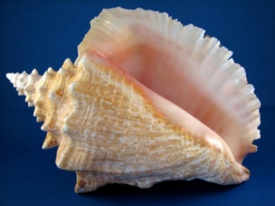
After that I did mirror. Mirror was really short, and it was also short for my adulthood room. I think mirrors are.. limited. You can't play with it very much, otherwise it won't serve it's purpose in reflecting a person's appearance. The only thing you could change was it's shape. Otherwise it would just be a decorative piece. This time I wanted to reflect a positive aspect of an elderly's life, of what I thought an elderly would/might have achieved at in end stage of life. I thought of the theme 'wisdom', and I went to research for symbols of wisdom. I didn't get much information, I only got a few. There were things like African symbols, Chinese characters.. And then I remembered that a conch shell carved on a tombstone symbolized wisdom. So I got these two pictures:


I drew out their outlines as my prep work, and I think that was all I did. The silhouettes of conch shells were really aesthetically appealing and I think it was appropriate for my mirror. It makes my mirror both useful and decorative.

Next was the settee set. As each human being grows, their physical size grows and hopefully, as well as their mental capacity, in terms of wisdom and everything. So, for each room, not only does the area and perimeter of the room increase, the number of furniture in the room also increases. As I brainstormed for this settee set, I thought of using everyday objects like.. in Rene Magritte's "Personal Values". Things like shoes, telephones, cutlery.. Or old things like gramophones, rocking chairs. Then I thought of wheelchairs. As the Chinese saying goes, 'sheng lao bing si', first one is born, then one will get old and sick, and eventually one will pass away. In a way, my elderly room also revolved around this Chinese saying, constantly reminding viewers that aging and death is part and parcel of life.

Initially I drew things like denim shorts, chopsticks & bowl. But they didn't seem to connect very well.. They didn't seem to be exactly what I wanted. After that I played with the idea of a wheelchair. But I thought, even though the elderly would eventually die, it would still be like, directly cursing them if I simply put a wheelchair into the room. Then I thought of something else.


See that, the handicapped logo up there. I thought of playing with the arrangement of furniture more instead of the design of furniture, such as.. arranging the furniture in a way whereby the aerial view of the settee set would look like that logo up there. Thus, I came up with several arrangements and chose one. This arrangement would consist of (subject to shape change) a typical Victorian/Baroque-style coffee table, my self-designed rocking chair, and a typical Victorian/Baroque-style sofa. When I say typical, I meant like this:


Marble topped, curved design legs.
And the sofa is something like this:


Cushioned, comfortable-looking seats and cornicing on the frame.
In the end, I got an arrangement close to the logo. Arranging them to look like the logo was NOT as easy as I thought, in fact, it was a lot harder!!!

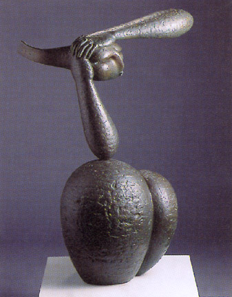
Having mentioned the rocking chair already, I shall now talk about the rocking chair. I designed the rocking chair and the double stool (to be at the foot of the bed) with the same concept which is 'time'. I used the hourglass. I sort of morphed an hourglass and a rocking chair together to create 3 different designs of rocking chairs. (this would be a lot easier to describe if I had scanned my prep work beforehand) 1 of the 3 was different, the hourglass didn't make up the entire rocking chair, but it was placed underneath the seat in a horizontal position. It envisioned the saying 'sitting on lost time'. It's like, with the majority of elderly's lives behind them, I'd expect them to be somewhat sentimental? From this rocking chair, I morphed it into a double stool.

As for the desk, I tried to use pens as inspiration, because people do their writing on desks. First off, let me show you what a classic Victorian/Baroque desk looks like:


Cubby holes, and again curved-designed legs.
For pens, I dabbled with the olden quill pen and the modern gel pens.


I thought of integrating the quill pen's shape into a desk. In the end, there was a dome on part of my desk and it was partly suspended on the walls because I wanted to make the legs asymmetrical. So there was this strange balance, heavy cubby holes on one part on the surface of the desk and supporting leg on the other part below the desk.


For the modern pen, I actually used my real life pen as a reference, but for blogging purposes I found this picture online. It's the pen I use everyday, Pilot G2. It was hard to come up with something from this modern pen. Eventually I thought of adapting the relatively curvy shape of the modern pen and bring it into the legs of the desk. As for the top of this desk, I thought of rectangular cubby holes but it felt rather boring, and so I changed it to a dome shape again.

I had most difficulty with the designing the wardrobe and the shelves. I could not think of ANYTHING. Eventually I didn't choose my original design for the shelves, I decided to use just a classic Victorian/Baroque shelf. It looks like this:


But plainer, more simplified, because I wanted to tone down the complicated-ness of the Victorian designs. Also, in my imagination I was thinking of darker wood.
As for the wardrobe, I used the shape of a sock and created a chest of drawers. I think that a chest of drawers really fits into the Victorian era very well. For mine, one part of the chest was directly touching the ground while the other part was propped up on legs. This uneven choice of legs was due to the sock's shape. I mean.. the side view of socks:


One side is lower than the other.
After all the furniture designing, I did layout and I was done.

If I had to reflect on all the 3 rooms, I would say.. the elderly room was my worse done one. It was more than a challenge. I would probably give 5 out of 10 for it, my adulthood room would be a 6, and my childhood room would be a 7.

Wednesday, September 14, 2011

Andy Goldsworthy


Today's AEP SOVA lesson was about Andy Goldsworthy. I think, if I remember correctly, this is the first time the SOVA lesson is so video-based, and no information was given to us prior about the artist or his artworks. Mrs Tan asked us to think about his personality, the challenges he faced, the setting he chose, the feelings/thoughts we get from his works, etc.

I was actually.. awestruck. There's a saying that goes, 'the world is your oyster', or something like that. And for Andy Goldsworthy, the world is literally his 'oyster' and his canvas. I was jotting down a lot of his words while watching the video. He says some really abstract things. For example, he feels 'uprooted' when he is travelling, and he doesn't like travelling. He also said that, he is amazed at times where he is actually alive. He also finds 'beautiful balance' when he takes his artworks to their edge of their collapse. It's very, very different.

The first things shown were the bird's eye view of a lot of meanders. Then there were some of his artworks. I didn't know what to expect, until I saw a lots of leaves.. He arranged the leaves in a straight row, and I don't know how he did it. There were curving lines representing meanders ON the leaves. After awhile, they were blown away by winds. Then there was this thing in the river, I didn't know what it was either. It's like a long white strip of something, floating on a river, and it was also curved to look like meanders. It was flowing down the river, and probably would be lost sooner or later.

From these, I gather that Andy Goldsworthy is fascinated by the relationship between time and tide. Growth. Time. Change. The idea of flow in nature. When the leaves flew away, it suddenly dawned on me that, (although maybe he didn't intend to express that) tide is erased by time. Tide - representing the present and the past - can be erased by time.

Then there was another artwork where he used broken pieces of icicles and stuck them onto this branch thing. He stuck them on 2 different sides of the branch thing in such a way that, it's like meanders flowing through the branch? It's hard to describe his artwork, and they really gave me a very abstract feeling. After that, when he completed it, the sun was setting. Unexpectedly, the setting sun's light illuminated the entire icicle structure and the whole thing was beaming. If I were him at that time, I probably would feel very, very, very satisfied, as though nature was rewarding me. Also, coincidentally, icicles are made of water. Water represents tides. When he tried to stick those pieces of icicles together through melting and re-freezing, some of them fell. It sent me a message that lost time cannot be replaced. Like, broken things are just that, broken. What's done is done, and cannot be undone. But that's just my personal realization.

Another thing I remembered was the stacks of rocks he did in varying places. It reminds me of Monet's Haystacks series, doing the same thing in different places. Maybe not at different timings, but Andy Goldsworthy left his stacks of rocks over a long period of time and observed how the environment changes around those stacks. One of those stacks were made up of red rocks and was placed in a green field, another was made up of beach rocks and placed on a beach. The video showed how, over time, the grass grows, the tides rise, and eventually the rocks are buried by grass/water. Immediately, I thought of the idea of time & tide again, such works seem to emphasize the passing of time.

I think he faces many challenges when he's doing his art. The unpredictable forces of nature may or may not help him in his endeavours. The leaves may fly, the icicles will melt, the rocks could crumble, anything could happen. But, I think he likes it that way when it is unpredictable and ever-changing. His tools for creation come from nature, his inspiration comes from nature and he just improvise. He's like, as fluid as nature when creating his works. It's all spontaneous, he barely does any prep work. But also, his works tend to be short-lived and temporal, and have to be documented with photography. That's another thing he has to deal with given the way he chose to do his art. I think it's really serene, out of the box and gives a whole new idea of what art could be like. It's completely refreshing, it's art but it's neither a sculpture nor a painting.

AEP Coursework: Final Submission

So.. AEP coursework's final submission is FINALLY OVER. I swear, it was like all hell broke loose, everything was a rush! I'm so relieved that it's over. Erm, the scanner wasnt A2. Each photo is half a blackboard, some are even truncated.

Well, for composition of these blackboards, I aimed to show the evolution of my furniture from its inspiration to its final outcome. I arranged them in order, first the childhood room, then the adulthood room, and finally the elderly room. Also, after I presented all the pieces of furniture, I presented the various layouts I came up with.