Wednesday, September 14, 2011

The Search for Inspiration

My greatest difficulty when designing the elderly room was inspiration. I did not know where to get my inspirations from. My entire coursework is about the different stages in life, like what each stage is all about and the general characteristics of people in these stages. My childhood room is about being natural and it's organic, and my adulthood room is about being burdened by the different aspects in life and thus losing freedom and becoming rigid. I was once a child, so I know what it's like. I'm almost an adult, so I know some things, and I can imagine some things. But, I'm far from being an elderly, and I don't know much about the elderly!! I can't seem to capture the mindset of the elderly. What exactly do they do with their time? What do their lives revolve around now that their prime time has passed? What do they think about all the time? I hadn't a clue.

I didn't know what were the general characteristics of life as an elderly. So it was purely based on imagination and gut feeling. First I did research, blind research. I simply Googled 'elderly' and scrolled randomly, waiting for inspiration to hit me. It helped a little, but not much. Soon I thought of some things. Maybe I could give the room different themes like the '60s, or the '70s. Or maybe I could use old technology to create furniture, old technology like gramophones. Still, the categories were really broad, I needed something more specific. Not all elderly come from the '60s, not all elderly reminiscence about their pasts.. It was seriously diverse, to me at least.

In the end, I decided to just go with the flow - no definite theme. I would use some daily objects as inspiration when designing furniture, and then give a certain 'old age'/'antique' feeling to the room. The idea of using daily objects came from Rene Magritte's "Personal Values" (below).
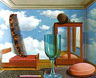


Though her usage of daily objects didn't serve a realistic purpose, like you can't sleep on the bed if the comb is there, I, on the other hand, would create furniture out of daily objects that serve a realistic purpose. Example, maybe I could transform a shoe into a chair?

After awhile, I started to find a colour scheme for this room. The childhood room was cheerful and earthly, and the adult room was minimalist (sort of), just a combination of black and white and maybe a 3rd colour that wasn't dull (red/blue/yellow/green/purple?). I also needed to know what sort of textures or materials I might use for the elderly room. With the desired texture/material in mind, it allows me to design furniture accordingly. For this aspect, I immediately thought of the Old French/Victorian/Baroque era. When I look at a room designed in the Victorian/Baroque style, it feels warm, comfortable, inviting...


Feels luxurious, and commands respect as though its royalty. There seems to be common traits in rooms that are designed in such a way. Traits such as.. intricate carvings and details on each furniture. There never seems to be a plain surface, everything is curved in or out, like a path that has been walked on before. The beds in these bedrooms are also kind of exaggerated, the duvets enhance the magnificence of the already-fancy headboards, and it appears really majestic. All these, together with the addition of a lavish rug and a posh chandelier, seem to highlight olden beauty? If I were to link it with the concept of the elderly, I think they matched relatively well.

However, as grand as Victorian rooms were, and as much as I liked the idea of rooms that command respect, it didn't fit a 100% with my concept of what an elderly is like. I feel that, having lived a long life full of ups and downs, an elderly would probably wish to settle down, tone down the excitement in their lives, and slow down the pace of life. To them, many things in live probably would be like, 'Oh, been there, done that', and not much amazes them anymore. So, to counter this problem, and if I really want to use the Victorian idea, I would have to simplify the intricacies until it fits into my frequency, until it's exactly what I want.

Before, I didn't have any direction and I didn't know what I wanted, so it was hard to get going and I felt like I was lagging behind in my prep work. Afterwards, I produced a somewhat solid concept of what kind of elderly room I want. I want simplified Victorian, with bits of everyday objects infused into it, so as to show that the elderly are living the end of their lives and have probably experienced a bit of most things in life.

Wednesday, May 4, 2011

Art Critics Help Viewers Perceive, Interpret, and Judge Artworks.

i think this statement is true, but i dont think it applies to all artworks. i think it should only apply to artworks that were created by the artist with a clear purpose. when there is a clear purpose, people tend to narrow down their options, and keep their eyes focused on the goal. so, for example, the Impressionists always aim to capture the fleeting light in their paintings, so their artworks always show the difference in lighting during different times of the day, or even different times of the year. one such example is Monet's famous Haystacks series.


the left one is painting during sunset, and the right one is painting on a foggy morning.


the left one here is painted near the end of summer, and the right one is painted during winter.

so when the artwork has a purpose, it most likely will show in the artwork. and that's when the art critics, with their art education and all, would be able to scrutinize the artwork, and see things that normal people are unable to see. through the eyes of a normal person, maybe Monet's painting of haystacks over and over again would get boring over time because they dont understand is so interesting about painting the same object repeatedly. but through the eyes of art critics, they are able to identify the different elements in an artwork and hence, understand the artwork too. this would make artworks more interesting to them, and after knowing the true meaning behind the artwork, based on their personal views, they will also be able to decide whether they like that artwork or whether they dislike it.

somehow it feels like they are the spokesperson for art.. but that's just what i feel. because if there were nobody to introduce art to normal viewers, unless the artwork makes a deep impression, they wouldnt be intrigued to find out more about it or even develop an interest in art. art critics are there to provide their own point of view, and shed some light for these viewers. with more information, they can develop their own views of the artwork, and maybe even develop an interest in art.

for example, Cubism. initially, i didnt really like it. it is so abstract, so avant-garde, and was almost too abstract for my liking. i mean, just look at this:


it's just a brown background with some shading, and random lines. if i didnt know anything about Cubism and if i werent in AEP but i saw this painting, i would never have known that this painting is a guitarist that is broken down into geometric shapes by Pablo Picasso, and i probably would have lost interest in it.

thus, i think that art critics really help viewers form their own opinion of artworks, especially viewers with no art education or interest in art.

however, i think that there are limits to how much art critics can help a person perceive, interpret and judge an artwork. for abstract artworks, i dont think there's an absolutely "correct" way to interpret them, especially if they were made without a clear intention in mind. if the artist created a completely abstract artwork, or even Dadaists who created artworks by chance, how, then, are art critics supposed to interpret them "correctly" when the scope is so wide that anything may be considered?

AEP Coursework: 1st Submission (part 2)

CLICK TO ENLARGE~

so.. my checklist/planning is in part 1, so i'll just jump straight into the furniture.


designing the bed.


designing side table.


designing shelves.


designing the mirror?


designing wardrobe~


designing the chair.


playing with the layout of furniture in the room.


chosen the final layout.

i think im quite inconsistent with my quality of drawing when i draw the furniture that i designed? because when i look through the scans, i can tell some of the lines are not parallel when they are supposed to be and then it looks weird. this can be seen in the page where i design the side tables (idea 2). however, i think the general idea is still there.

also, i think i should have used rulers for all the drawings instead of just some. but after awhile i dabbled in drawing 3-point perspective at an eye-level, which is shown in the 2nd page of when i was designing the shelves. and i think it looks more realistic than drawing 2-point perspective from bird's eye view all the time. but 2-point perspective from bird's eye view seems to be the easiest and hence the quickest, so i always use it when designing individual pieces of furniture.

AEP Coursework: 1st Submission (part 1)

CLICK ON THE IMAGE TO VIEW A BIGGER VERSION OF IT IF IT IS TOO SMALL


this page shows my thought process from the beginning.


this is my planning for each of the individual rooms. it's also like a checklist for me along the way, to keep track of what i intended to design but havent yet.


i used these 3 pages to design the bed for the childhood room..


designing the lighting..


designing the wardrobe..


designing the window seat..


bits of the start of designing the window seat are shown here..
as well as my first idea layout (overall view), and the more 2D/3D version of the room in that particular perspective. i think it wasnt drawn very accurately though, but it's just a rough sketch.


final layout (top view), and a 3D (2D??) version what the room looks like. it's a draft for now, because i want to show the final outcome by drawing a 3-point perspective, i hope that's what it's supposed to be called (looks more realistic than what i have already drawn).

overall, this is the foundation for the childhood room. i intend to design most of the furniture for all of the 3 rooms. all of them would have a final layout as well as a 2-point perspective draft and a 3-point perspective final. im still practising for the 3-point perspective ones, so i will only do them after i finished all the 2-point perspectives drafts for all 3 rooms. and at the end of all the 3-point perspective drawings, i'll experiment with colour for all the 3 rooms i think, and see how it goes from there.

for the first submission, i submitted the childhood room and the adulthood room. (adulthood room scans will be in part 2 of this blog entry. anyway, for the childhood room, i realized that drawing still-life drawings with thin, light outlines will make the drawing more realistic as compared to bold outlines. initially i drew the flowers with bold outlines and they looked flat like cartoons. apart from that, i think that my faber-castell pencil and my lyra pencil have different textures when i use them to shade.. this can be seen when i designed the wardrobe. on the first page, i used the faber-castell pencil and on the second page, i used the lyra pencil. (maybe it's not visible on digital scans, but more visible in real life though)

lastly, i think i need to improve on my 2D & 3D drawings. so i think there should be an improvement when i start to design the elderly room. :D

Lucia Hartini "Srikandi"


a) Describe the use of space, colour and brushwork.

The space in this painting is very dominated by the female character and the brick walls. The left side of the brick wall in the painting is a straight, slanted line that runs across the painting, as though it divides the foreground, consisting of the female character and the brick walls, from the background, consisting of the cloud-filled sky and the moon. Also, the brick walls seem to extend further beyond the painting’s boundaries, hence the space displayed in the painting appears to be rather confined, thus increasing the viewer’s attention on the female character. The dominance of the female character in the foreground also indicates the amount of emphasis Lucia Hartini has placed on her. This could be because Lucia Hartini sees herself as this resilient and sturdy character, which was actually inspired by Srikandi (a brave and bold female figure in a Javanese shadow puppet).
Where the straight line of bricks divide the painting, a strong contrast, between the vast freedom in the sky and the small, constricted space between the bricks walls, is created. The character, however, is located in the constricting space between the brick walls, which could suggest that Lucia Hartini feels very restricted in real life due to her social status. Beyond the thin, straight wall of bricks, there seems to be a small piece of sky in the painting. This small portion of the sky could represent the little freedom she owns in actual fact.
The colours used in this painting are mainly orangey-brick red and deep blue. These two colours are contrasting, and when placed side by side, they compliment each other and create a striking effect, catching the eye of the viewer easily. Red-orange tends to portray aggression and thirst for action, and suggests that Lucia Hartini's artistic capabilities could be supressed in real life. The deep blue dress worn by the female character compliments her strong stance with her hands akimbo, and surrounds her with an aura of power. Blue was also a colour worn by women's armies of the past who had the duty of protecting the Sultans of feudal Central Java, so Lucia Hartini may have intended to portray this person or herself as a brave female warrior. Deep blue against the red-orange, again, places more emphasis on the female character. The colour of the female character's skin is a tanned brown and appears to be glowing with energy and might. This portrays the female character as a strong person.
The colours in the background are the opposite of the colours used in the foreground as they are softer and less eye-catching. The light blue brings out the weightlessness of the clouds, and the pale yellow light softens the whole image altogether. The combination of light blue and pale yellow successfully depicts the vastness of the azure sky, exuding the idea of freedom. The gentle addition of the moon in the sky adds on to the calming effect, imitating the tranquility one would feel when gazing at the moon in real life.
Lucia Hartini's brushwork is similar to that of Surrealist Salvador Dali's in the sense that their brushstrokes are both exceptionally well-blended despite the fact that the details are meticulously added. As a result, they both create very realistic-looking images of the fictional world they create in their paintings. In this painting, there is a very obvious contrast between the fluidity of the dress and the hardness of the brick walls, no doubt done by her remarkable brushwork. Lucia Hartini's brushwork has conveyed her intention to contrast the flexibility of the dress and the brick walls. Her refined brushstrokes enable the viewer to see every crease on the dress and every crack on the wall, reinforcing the fact that the brick wall is unable to create the same flowing effect as the dress. This could represent how Lucia Hartini herself, in real life, has to compromise herself in order to deal with the criticism of the male-dominated society.


b) Comment on the influences behind this work.

The most obvious influence behind this work is Srikandi, because that is the title of this artwork itself. Srikandi is a Javanese shadow puppet of the Mahabharata epic, and is a brave and bold female character who projects a daring, strong and powerful image. She is the archetypical "Warrior Woman" of the Southeast Asian legend. Inspired by this, and as a result of her environment, Lucia Hartini has portrayed herself as Srikandi in this painting as the face of the female character very much resembles her own face in real life.
Lucia Hartini was born as a Catholic in a predominantly Muslim environment. The Muslim culture believes that women were born to serve men, and thus brings about gender discrimination within the Indonesian society. Women were only expected to cook and have children. This stereotypical expectation of the society may be diminished in the modern countries, but it still exists in the Indonesian world. Lucia Hartini, who chose to study art and pursure a career as an artist, has become a target of scrutiny for the critical society.
During the early years of her career, she hardly drew any human figures in her artworks, let alone a female character that resembles herself (like in Srikandi). It shows that she has come a long way from being a fearful victim of domestic violence to the secure, self-assured woman she is today.
Srikandi was an artwork marked the start of her newfound self-confidence. From the late 1970s up until she painted Srikandi, Lucia Hartini mainly painted female figures that were weak and vulnerable, just like what the society expects women to be like. However, over time, through her own experience, she decided that women should represent themselves as capable equals of men.
Living in an environment where straightforward methods of expressing herself were unacceptable caused her artworks to be filled with symbolism. These symbols help her to convey her innermost emotions subtly, allowing her to avoid the criticsm of the society. In Srikandi, Lucia Hartini has depicted how close she is to breaking free from the prison of tradition, represented by the cracked brick walls. She has conveyed her yearning for freedom through the serene sky. She has showed the viewers how strong she has become by portraying herself as the female warrior, Srikandi. Lastly, the female character in the painting is daringly looking back at many disembodied eyes. These disembodied eyes represent the society's scrutinizing eyes, which, to Hartini, felt like they followed her wherever she went and always wanted to watch her business.
In her previous work, Spying Eyes (1989), she had also used disembodied eyes, but those disembodied eyes overpowered the female character in Spying Eyes (1989), leaving her in a vulnerable foetal position. However, in Srikandi, she is staunchly staring right back at all the eyes, which demonstrates how she courageously fights for her own footing in that society. Srikandi is a work that sums up how Lucia Hartini became a confident and strong woman.

Done On: 29 March 2011

Friday, February 4, 2011

Art Stage 2011


credits to The Straits Times


Although I didnt attend the Art Stage, I did hear about one particular artwork that caused a stir. There was a man who took pictures with people who wanted to in the buff. His pose and the visitor's pose copied that of the 2 Fridas in "The Two Fridas" (1939).

Honestly, I dont have a very wide knowledge on artists all around the world. So actually, I didnt know anything about that painting, much less know anything about the painter herself, Frida Kahlo. I only knew she was a female, and she was Mexican. But, I Googled her a little, and read up a little about "The Two Fridas" (1939), and then I went to read The Straits Times article about Mr. T Venkanna, the artist who was taking photos in nude during the Art Stage.

And, I actually would like to commend him on his endeavour, because being nude, being nude in public, and being nude in public for art are all different. Being nude is like, in the shower, or when you're changing clothes. Being nude in public could be offensive or not offensive. I saw such things happen in Montmarte, the so-called 'artist square', when I went there during the AEP Europe trip last year. THAT was not offensive, but it wasnt offensive because of the crowd I suppose. They were open-minded. I'm not too sure about Singapore though. After all, being nude in public IS against the law.

But what about being nude in public for art? I would say that it shouldnt be against the law. In fact, I dont even think being nude in public should be against the law. I mean, if someone is purposely harassing you (like a flasher, who is technically naked, or something), then it would be categorized under 'sexual harassment'. Would being nude be an extra charge?? I dont know, but I think it should not be counted as an another offense.

So yes, being nude in public for art is acceptable for me. Mr. T Venkanna is very brave, and I think he is going a step further than others where art is concerned. Everybody else is doing paintings, still-life or not, otherwise its sculptures, based on nude models or not. But what Venkanna has done is pretty rare now, isnt it?

I once watched a drama, and there was this particular episode. There was a man who liked tattoos, but he wouldnt stop at just tattoos alone. Let's say he has a skull tattoo, then he would shoot a bullet at the eye of the skull tattoo, so as to create a gunshot-scar eye for that skull tattoo. Even though it is a drama, the main point is still the same as Mr. T Venkanna's art. He takes an extra step, even if it may be extreme, and he gets noticed more than the rest.

Moreover, Mr. T Venkanna's exhibit was hidden behind a black curtain, and there was a sign that warned people of the contents. So why shouldnt it be acceptable? If it's unacceptable, it should be unacceptable for Mr. T Venkanna himself, because he's the one who has to be seen in the buff by many, many strangers, and even take pictures with them.

In conclusion, I think it's taking a different path from others which makes something more outstanding. If somebody's already walked there, then a path is created. So why follow somebody else's footsteps, when you can discover a whole new way for yourself?

Monday, January 31, 2011

It Started With Sims...

The two possible art careers I would ever consider are fashion design or interior design. When I tried out fashion design last year, I realized that I wasn't really into it. Interior design, however, means a whole different thing to me.

I suppose my interest in interior design sprouted from a simple, addictive game called Sims. I like the game Sims because it was fun, but apart from the main game, I was also really fascinated with the graphics, the character design, and of course, the interior design. Whenever I started a new family, I would take 20 minutes or so to design the architecture of a house, and then take hours to painstakingly do the interior. Each and every room had a colour theme, and I simply chose any object that looked pleasing to the eye in that particular room.

In such a casual situation, I was able to create rather amazing rooms if I may say so myself. The slideshow below contains a some images of my creations. At that point of time, these screenshots were taken with the intention to capture the game's events, but I chose the ones that showcased the background design/house architecture more and made them into a slideshow. So this slideshow is really more of a preview, for myself, to summarise what I can do.


I am now in the midst of considering interior design for my coursework. I really, really want to do it, even though I have never had any professional experience in doing floor plans or anything like that...